
The recruitment metrics to track first are time to fill, time to hire, cost per hire, source-to-hire conversion, offer acceptance rate, quality of hire, and candidate NPS. Between them, these seven cover speed, cost, channel effectiveness, candidate interest, and long-term fit, which is the full picture any hiring team actually needs. The sections below give you the formula for each one, realistic benchmarks, how to segment them by role and seniority, and what to do when a number turns bad.
TL;DR:
- Tracking only overall metrics can mask bottlenecks; segment the data by role, source, and stage to identify specific leak points.
- Cost per hire should include all relevant expenses, like recruiter time, ad spend, and assessment tools, to accurately reflect true hiring costs.
- A high offer rejection rate often signals issues with compensation or process delays, which can be detected early through candidate feedback and decline reasons.
- Monitoring stage-level velocity reveals internal bottlenecks, especially in interview or approval processes, rather than blaming sourcing efforts.
- Focusing on three to five core KPIs with clear owners and actionable insights leads to better recruitment performance than tracking broad, unfocused dashboards.
Table of Contents
- What recruitment metrics actually measure (and the difference between a metric and a KPI)
- The core hiring metrics to track, with formulas and benchmarks
- Funnel and conversion metrics: finding where candidates are lost
- Making cost per hire mean something to finance
- Quality and retention: whether the hire actually worked out
- Choosing your 3–5 KPIs and building one dashboard
- Turning the numbers into action: a repeatable improvement cycle
- Rolling this out in a small HR team
- Recruitment velocity: speed through every funnel stage, not just the total
- Applicant drop-off: where candidates disappear from your pipeline
- Diversity hiring metrics: measuring representation without guesswork
- Recruiter performance metrics: measuring the people running the process
- Time to productivity: the metric that starts after the hire is made
- Why fewer, sharper metrics beat a crowded dashboard
- Where these figures and definitions come from
- Sources
- FAQ
What recruitment metrics actually measure (and the difference between a metric and a KPI)
A metric is any number you can pull from your applicant tracking system. A key performance indicator, or KPI, is a metric you have deliberately chosen to manage against, with a formula, a reporting cadence, and a named owner attached. Without those three elements, a metric rarely drives change. It just sits in a spreadsheet nobody opens twice.
Recruiting KPIs generally fall into three tiers, and knowing which tier you are looking at stops you from treating every number the same way.
- Operational metrics track day-to-day execution: time to fill, time to hire, applicant volume, interview-to-offer ratio.
- Strategic metrics connect hiring to business outcomes: cost per hire, quality of hire, first-year attrition, source of hire quality.
- Experience metrics measure how the process feels to the people going through it: candidate NPS, offer acceptance rate, hiring manager satisfaction.
One practical approach recommends running with three to five core KPIs for leadership reporting, while tracking a wider set operationally so problems surface before they hit the board pack. That split matters because a dashboard with thirty metrics and no owners is not a measurement system, it is noise. Every KPI you keep needs a single accountable owner, a defined timeframe (weekly, monthly, per requisition), and one authoritative data source, usually your ATS, not a mix of spreadsheets and gut feel.
The core hiring metrics to track, with formulas and benchmarks
This is the working set. Each one has a clear formula, a rough benchmark, and a note on what to do when the number turns against you.
- Time to fill. Formula: days from job requisition approval to accepted offer. Benchmarks vary heavily by role family. Less complex roles typically fill faster, while senior engineering or executive searches may take considerably longer. Always split this figure by role and seniority rather than reporting one blended average, because a single slow executive search will drag your overall number and hide the fact that your admin pipeline is actually running fine.
- Time to hire. Formula: days from a candidate’s first application or first contact to accepted offer. This differs from time to fill because it measures candidate-side speed rather than requisition-side speed. It is the number that tells you how competitive your process feels from a candidate’s chair. A breakdown of funnel stage benchmarks can show you exactly which stage is adding the days.
- Cost per hire (all-in). Formula: (internal recruiting costs + external costs) ÷ number of hires. The mistake most teams make is leaving out recruiter salary time, which is why guidance on this metric stresses including every relevant line item: job ad spend, agency fees, recruiter hours, assessment tools, and referral bonuses. Leave any of those out and you understate the true cost of hiring.
- Source-to-hire and source conversion. Formula: hires from a channel ÷ total applicants from that channel. This is different from raw source of hire (which channel produced the most hires) because it tells you which channel converts best, not just which one is loudest. A job board that sends you 500 applicants and three hires is performing worse than a referral program that sends twenty applicants and four hires, even though the board looks busier on a volume report.
- Offer acceptance rate. Formula: offers accepted ÷ offers extended. A typical healthy offer acceptance rate is considered high; rates significantly below this usually signal issues with compensation, timing, or candidate experience. Always capture decline reasons at the point of rejection, not weeks later, because the reason candidates give in the moment (counter-offer, salary gap, slow process) is far more accurate than anything reconstructed afterwards. There’s a deeper breakdown of this metric worth reading if acceptance is trending down.
- Quality of hire. No single number captures this, so build a composite score from 90-day performance reviews, first-year retention, and hiring manager satisfaction ratings collected at 30, 90, and 180 days. Quality of hire should combine several of these signals rather than relying on one proxy like tenure alone, because tenure without a performance rating tells you a hire stayed, not that they were good.
- Candidate Net Promoter Score (cNPS). Formula: percentage of promoters minus percentage of detractors, from a single “how likely are you to recommend applying here” question sent after every stage of rejection or hire. Run it on a rolling basis rather than once a year, and don’t panic over small sample sizes; even fifteen to twenty responses a month will show you a trend line worth acting on.
Pro Tip: Pull decline reasons and cNPS responses into the same monthly review. A dip in acceptance rate almost always shows up in candidate feedback two or three weeks before it shows up as a hard number, which gives you a head start on fixing it.
Funnel and conversion metrics: finding where candidates are lost
Every hiring funnel leaks somewhere, and blended pass-through rates hide exactly where. Recruiting guidance for 2026 warns that averaged conversion numbers routinely mask a single broken stage, so segment before you diagnose, not after.
- Application-to-screen rate: screened candidates ÷ total applicants. A sudden drop usually points to a job ad that’s attracting the wrong audience.
- Screen-to-interview rate: interviewed candidates ÷ screened candidates. This is where a misaligned job description or an overly strict initial filter shows up.
- Interview-to-offer rate: offers made ÷ candidates interviewed. A rate under 20% across multiple roles often means your interview panel is inconsistent, not that candidates are genuinely unqualified.
- Applicant-to-hire ratio: total applicants ÷ total hires for the role. Useful for benchmarking sourcing effort against outcome over time.
Segment every one of these by source, role family, and hiring manager before drawing conclusions. If interview-to-offer collapses for one hiring manager but stays healthy everywhere else, you have found a calibration problem, not a talent shortage. When a stage drops by more than 15 percentage points against its own trailing average, treat it as a signal to investigate that week, not at the next quarterly review.
Making cost per hire mean something to finance
Cost per hire is only useful when both finance and talent acquisition agree on what’s included. A number that only counts job ad spend will always look artificially good, and that gap causes more budget arguments than any other recruiting metric.
Include these in your all-in calculation:
- Job advertising and job board fees
- Agency or contingency recruiter fees
- Recruiter and hiring manager time, costed at an hourly rate
- Assessment tools, background checks, and ATS licensing allocated per hire
- Sign-on bonuses and relocation costs where applicable
Cost-per-hire tracking that leaves out recruiter time commonly understates true cost in smaller teams, because a founder or ops manager doing double duty as a recruiter rarely logs those hours anywhere. Complement raw cost per hire with cost per qualified candidate (total sourcing spend ÷ candidates who passed initial screening), which tells you whether you’re paying for volume or paying for relevance. A cheap hire that quits in four months costs more than an expensive one who stays three years, so never present cost per hire to stakeholders without quality of hire sitting right next to it on the same slide.
Quality and retention: whether the hire actually worked out
Quality of hire is the metric everyone agrees matters most and almost nobody measures well, because it can’t be pulled from a single ATS field. Build it as a composite: weight a 90-day performance rating, a 180-day or first-year retention flag, and a hiring manager satisfaction score collected at each checkpoint.
- 90-day attrition rate: hires who leave (voluntarily or involuntarily) within 90 days ÷ total hires in the period. This is your earliest and most honest quality signal.
- First-year attrition rate: same formula extended to twelve months, better for catching poor culture fit that takes longer to surface.
- QoH composite score: average of normalised performance rating, retention flag (1 or 0), and manager satisfaction score, typically weighted toward performance.
Attribute every low QoH score back to its source, recruiter, and interviewer. If one sourcing channel consistently produces hires who underperform at 90 days regardless of how strong they looked on paper, that channel is expensive no matter how cheap the initial cost per hire looked.
Choosing your 3–5 KPIs and building one dashboard
Pick KPIs against three tests: is it actionable, does it have a named owner, and is it tied to a real business outcome rather than a vanity number. A metric that fails all three tests is dashboard clutter.
- Start with one from each tier. Time to fill or time to hire (operational), cost per hire or quality of hire (strategic), and offer acceptance or cNPS (experience).
- Segment by job family and seniority. Never let an executive search average blend with a high-volume retail hiring average; the two operate on completely different clocks.
- Assign an owner and a cadence to each. Recruiters own weekly operational numbers, TA managers own monthly strategic reviews, leadership sees a quarterly summary.
- Build one dashboard, not five spreadsheets. Pull everything from your ATS as the single source of truth, and resist the urge to reconcile numbers manually across tools.
| KPI tier | Example metric | Typical owner | Review cadence |
|---|---|---|---|
| Operational | Time to fill | Recruiter | Weekly |
| Strategic | Cost per hire | TA Manager | Monthly |
| Strategic | Quality of hire | TA Manager / HRBP | Quarterly |
| Experience | Offer acceptance rate | Recruiter | Per requisition |
| Experience | Candidate NPS | TA Manager | Monthly |
A service level overview is a useful reference point if you’re setting these benchmarks for the first time and need a sense of what “good” looks like across speed, outcomes, and experience together. Turning operational data into genuine insight is a discipline worth borrowing from analytics teams outside recruiting too.
Turning the numbers into action: a repeatable improvement cycle
A dashboard on its own changes nothing. The value comes from a loop: detect, diagnose, experiment, measure.
- Detect the anomaly, a conversion drop, a cost spike, a falling acceptance rate.
- Diagnose the likely cause using segmentation, is it one role, one source, one hiring manager?
- Run one experiment. Change a single variable, sourcing message, assessment threshold, or interviewer calibration, and hold everything else constant over a fixed window.
- Measure the result against the same window length used before the change, and only then decide whether to scale it.
Common fixes include reallocating spend away from a low-converting job board, redesigning an interview stage that’s producing inconsistent offer rates, or adjusting an offer policy when decline reasons cluster around salary. Small, single-variable experiments beat sweeping overhauls, because they tell you what actually caused the improvement.
Pro Tip: Never change two things at once when testing a fix. If you rewrite the job ad and switch job boards in the same week, you’ll never know which change moved the needle. Specific, actionable KPIs are far more useful than broad dashboards built to look impressive rather than drive decisions. For structured next steps, a process improvement guide walks through common fixes in more depth.
Rolling this out in a small HR team
You don’t need enterprise tooling to run this starter set well. Most SMEs can operate it with a spreadsheet linked to ATS exports and thirty minutes a month of review time.
- Assign one person to own the dashboard, even if it’s the same person doing the hiring.
- Segment from day one by role family (sales, admin, technical, trades) so blended averages never hide a problem.
- Review speed and cost monthly; review quality and retention quarterly, since those signals take longer to surface.
- If internal data is patchy, an experienced agency partner can supply clean time-to-fill and cost benchmarks from live searches, which is often the fastest way to expose hidden costs sitting in unpaid recruiter hours.
Recruitment velocity: speed through every funnel stage, not just the total
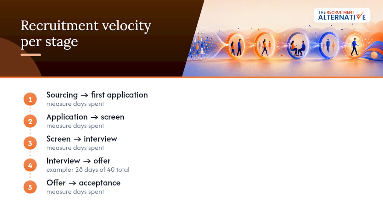
Time to fill and time to hire tell you the total elapsed time, but velocity tells you where that time is actually spent, and that distinction changes what you fix. Measure the number of days spent in each stage separately: sourcing to first application, application to screen, screen to interview, interview to offer, offer to acceptance.
A role that takes forty days overall might spend twenty-eight of those days waiting between interview and offer decision, which is an internal approval bottleneck, not a sourcing problem. Without stage-level velocity, teams routinely blame the wrong part of the funnel, usually sourcing, when the real drag sits with a slow hiring manager or a multi-step approval chain for offers.
Track velocity per stage against its own historical average rather than an industry benchmark, because internal processes vary too much for a generic number to mean anything specific to your business. If interview-to-offer velocity blows out by more than a few days compared to trailing averages, that’s usually the first stage worth investigating, since it’s the one most within the hiring team’s direct control. Fast velocity in early stages and a slow finish is one of the most common patterns in mid-sized teams, largely because early stages are usually owned by recruiters working to a clock, while later approval stages sit with hiring managers juggling other priorities.
Applicant drop-off: where candidates disappear from your pipeline
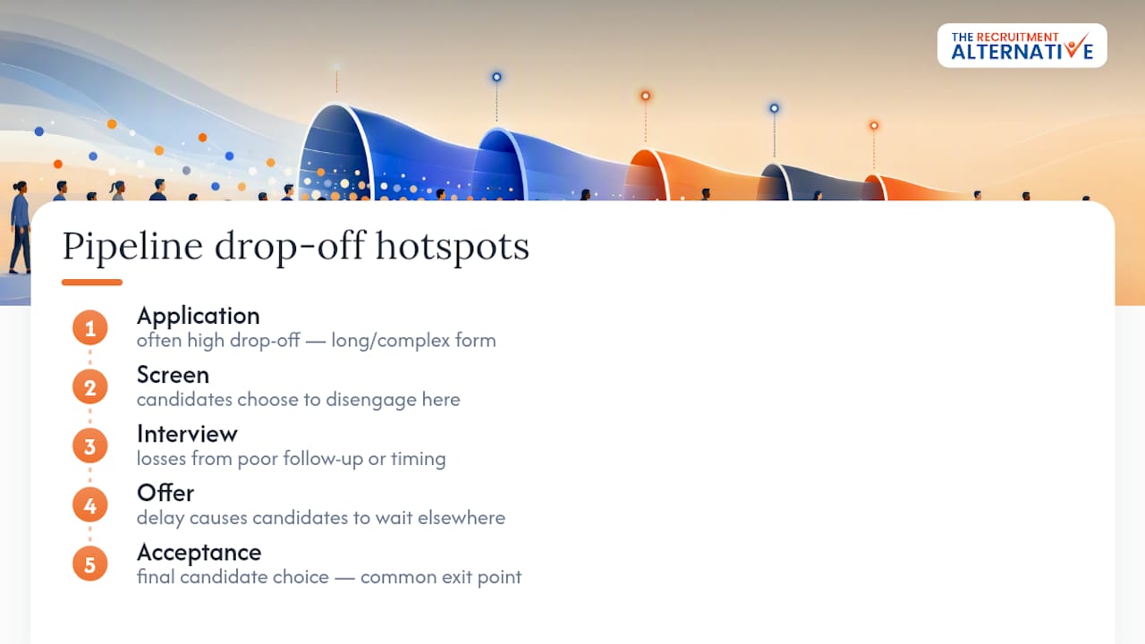
Drop-off rate is conversion’s mirror image: instead of asking how many candidates moved forward, it asks how many disappeared at each point, and why. Calculate it as candidates lost at a stage ÷ candidates who entered that stage, tracked separately for every step in the funnel.
The most instructive drop-off usually happens between application and screen, and between offer and acceptance, because both represent a candidate actively choosing to disengage rather than being filtered out by you. High drop-off after application often points to a job ad that oversells the role or a lengthy application form; recruiting KPI guidance consistently flags long or repetitive application processes as one of the biggest silent killers of pipeline volume.
Drop-off between interview and offer stages tends to be self-inflicted, usually caused by process delay rather than candidate disinterest. If a candidate hears nothing for two weeks after a strong interview, they will often accept a competing offer purely because it moved faster, regardless of which role they preferred. Track drop-off by stage and by source together; a channel with high application volume but heavy early drop-off is producing false pipeline health, not genuine candidate interest.
Diversity hiring metrics: measuring representation without guesswork
Diversity metrics work best when applied at each funnel stage rather than only at the final hire, because a representative applicant pool that narrows dramatically by interview stage tells you exactly where bias or process friction is creeping in. Track the proportion of candidates from underrepresented groups at application, screen, interview, and offer stage, then compare the ratios stage to stage rather than just the final headline number.
A common pattern is a healthy, diverse applicant pool that thins out sharply between screen and interview, which usually points to inconsistent screening criteria or unstructured shortlisting rather than a sourcing failure. If that’s happening, the fix is almost always at the screening stage, not the job ad.
Report diversity metrics alongside quality of hire and retention, never in isolation, because representation numbers only mean something when paired with evidence that the process is fair at every stage, not just diverse at the finish line. Keep this reporting cadence quarterly at minimum; monthly volatility in small hiring cohorts can be misleading given typical sample sizes at SME scale.
Recruiter performance metrics: measuring the people running the process
Individual recruiter performance sits underneath most of the KPIs already covered, but it’s worth isolating a handful specifically to manage recruiter workload and effectiveness. Track requisitions filled per recruiter per month, average time to fill by recruiter, offer acceptance rate by recruiter, and candidate NPS scores segmented by recruiter.
The most common mistake here is comparing recruiters on raw volume alone, which unfairly penalises anyone working executive or technical searches against colleagues filling high-volume, low-complexity roles. Always compare recruiter performance within the same role family and seniority band, the same segmentation discipline that applies to every other metric in this article.
Pair speed metrics with quality metrics for each recruiter. A recruiter who fills roles fastest but whose hires show the highest 90-day attrition isn’t actually your best performer, they’re pushing candidates through too quickly to properly assess fit. Review recruiter-level metrics monthly with the recruiter directly involved, since this data is most useful as a coaching tool, not a scoreboard.
Time to productivity: the metric that starts after the hire is made
Time to productivity measures the days or weeks from a new hire’s start date to the point they’re performing at the expected level for their role, usually assessed against a manager sign-off or a defined onboarding milestone. It’s the metric most hiring teams ignore because it sits outside their handoff to the hiring manager, and that handoff gap is exactly why it matters.
A fast time to fill means nothing if the resulting hire takes four months to become productive because onboarding was thin or the role brief was vague. Measuring this requires cooperation with hiring managers, typically a short check-in at 30 and 60 days asking whether the new hire is meeting agreed milestones for that stage of ramp-up.
Segment time to productivity by role complexity, a senior technical hire will always take longer to reach full output than an entry-level administrative role, and comparing them on the same scale tells you nothing useful. Where time to productivity is consistently long across a role family, the root cause often traces back to the recruiting stage itself, an unclear brief, a rushed interview process, or a quality of hire problem that only becomes visible once the person is actually on the job.
Why fewer, sharper metrics beat a crowded dashboard
Most hiring teams don’t fail because they lack data, they fail because they track too much of it and act on too little. A dashboard with twenty metrics and no clear owner produces the same outcome as no dashboard at all: nothing changes. The teams that improve fastest usually run five or six KPIs, reviewed by the same people every month, tied to one clear action each time a number moves.
The single highest-leverage change I’ve seen recommended repeatedly is pairing a speed metric with a quality metric on every report, never presenting one without the other. A recruiter who fills roles in eighteen days looks brilliant until you check the 90-day attrition on those hires. Balance beats vanity every time.
— Josh Townsend
Where these figures and definitions come from
Metric definitions and benchmarks in this guide draw on the Harvard Business Review for measurement philosophy, AIHR for metric catalogues, Recruiterflow for 2026 pipeline priorities, and Aptitude Research for cost-per-hire methodology.
If you’d rather have clean, benchmarked hiring data supplied for you than build the dashboard from scratch, The Recruitment Alternative’s flat-fee recruitment service runs permanent placements across Australia and New Zealand with transparent, tiered pricing and replacement cover if a hire doesn’t work out in the first two to three months, so you get the metrics that matter without absorbing the agency commission that usually inflates cost per hire in the first place.
Sources
- Your approach to hiring is all wrong | Harvard Business Review
- 23 Recruiting Metrics You Should Know
- 25 Recruitment Metrics to Track in 2026
- Aptitude Research report (Foundation of TA)
FAQ
What metrics do you track in recruitment?
The core set covers time to fill, time to hire, cost per hire, source-to-hire conversion, offer acceptance rate, quality of hire, and candidate NPS, each segmented by role family and seniority rather than reported as one blended average.
What are the 5 C’s of recruitment?
Definitions of the “5 C’s” vary across sources and aren’t consistently standardised in recruiting literature, so treat any specific version with caution rather than as an established framework.
What are the key KPIs to track in recruitment?
Most teams get the most value from a starter set of five to seven KPIs spanning speed (time to fill, time to hire), cost (cost per hire), effectiveness (source-to-hire conversion), and experience (offer acceptance rate, candidate NPS), backed by quality of hire as the long-term check.
What are the 5 key HR metrics?
Within recruitment specifically, the five most commonly prioritised are time to fill, cost per hire, quality of hire, offer acceptance rate, and first-year attrition, since together they cover speed, cost, fit, and candidate response.
How often should recruitment KPIs be reviewed?
Operational metrics like time to fill and conversion rates work best reviewed weekly by recruiters, while strategic metrics like cost per hire and quality of hire suit a monthly or quarterly cadence with a named owner such as a TA manager.